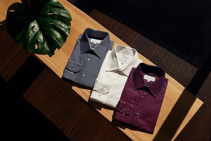
Men's Color Matching: Beyond the Basics
Elevate your style with advanced color matching techniques — from color theory fundamentals to monochromatic mastery, complementary combinations, and seasonal palettes.
Color Theory Fundamentals
Color matching is one of the most challenging yet rewarding aspects of men's style. Mastering basic color theory can dramatically elevate your outfit coordination. The color wheel organizes colors into three primary categories: primary colors (red, yellow, blue), secondary colors (orange, green, purple), and tertiary colors (yellow-green, blue-green, blue-violet, red-violet, red-orange, yellow-orange). For men's fashion, the most practical color relationships are monochromatic, analogous, complementary, and triadic schemes. Complementary colors sit opposite each other on the wheel (blue and orange, red and green) and create maximum visual contrast. Analogous colors sit adjacent (blue and purple, yellow and orange) for harmonious combinations. Monochromatic schemes use varying shades of a single color for sophisticated, understated looks. Beyond these basic relationships, understanding three core concepts is essential: hue (the basic identity of a color), value (how light or dark a color is), and saturation (how vivid or muted a color is). Mastering the manipulation of value and saturation is often the secret to creating outfits that look intentional and well-coordinated.
Mastering Monochromatic Dressing
Monochromatic dressing — using a single color in varying shades and tints — is one of the most sophisticated techniques in men's fashion. The key lies in creating visual interest through differences in lightness, saturation, and texture. For example, a navy suit with a light blue shirt and a sapphire tie creates depth while staying within the same color family. Fabric texture plays a crucial role here: wool, cotton, linen, and silk all render the same color differently. A charcoal flannel suit with a gray silk tie creates contrast through the interplay of matte and sheen textures. Pattern also matters in monochromatic looks: stripes, checks, or herringbone in similar tones add visual complexity without introducing new colors. For instance, a dark navy pinstripe suit paired with a light blue Bengal stripe shirt stays within the blue family but creates subtle visual rhythm through different stripe scales. The result is an outfit that looks intentional, sophisticated, and quietly luxurious.
The Power of Neutrals
Neutral colors — black, white, gray, navy, khaki, and olive — form the foundation of a versatile men's wardrobe. Advanced dressers know how to use neutrals as a canvas, adding small doses of saturated color for visual impact. A gray suit with a white shirt and a burgundy tie instantly draws the eye to the tie as the focal point. Neutrals also pair beautifully with each other: charcoal with khaki, navy with ecru, olive with sand. These combinations are timeless, foolproof, and endlessly versatile. The secret is varying tonal depth — pairing a light neutral with a dark neutral creates natural contrast. Beginners should build a neutral-based capsule wardrobe first before introducing colored pieces. One nuance worth noting: neutrals have warm and cool undertones. Cool gray should not be mixed with warm khaki in the same outfit, as the undertone clash can look unintentional. Cool neutrals like steel gray and navy pair best with silver accessories, while warm neutrals like khaki and camel work beautifully with gold or brass accessories.
Complementary Color Combinations
Complementary colors create maximum visual contrast and can be risky but rewarding. The most classic men's combination is blue and orange (navy suit with brown leather shoes). Another elegant pairing is purple and yellow (a lavender tie against a cream shirt). The key to wearing complementary colors without looking clownish is controlling proportion. Follow the 70-25-5 rule: 70 percent dominant color (e.g., navy suit), 25 percent secondary color (white shirt), and 5 percent accent color (orange pocket square). This ratio creates visual interest while maintaining sophistication. A safer way to use complementary colors is to desaturate one or both colors — muted blue-gray with soft rust orange is far more wearable than pure blue with pure orange. For the adventurous dresser, triadic color schemes using three equally spaced colors on the wheel (such as blue, red, and yellow) can create bold, artistic statements when carefully balanced.
Seasonal Color Palettes
Spring calls for muted warm tones — ecru, blush pink, soft yellow, mint green. These colors harmonize with the fresh, blooming environment of early spring. Summer favors cool, refreshing shades — sky blue, light gray, white, and lavender. These light hues reflect sunlight and feel visually and physically cooler. Autumn belongs to earth tones — camel, caramel, olive green, burgundy, and burnt orange, echoing the changing leaves and golden autumn light. Winter suits deep, saturated tones — black, charcoal, oxblood, forest green, and midnight blue. Adjusting your palette by season keeps your style relevant and harmonious with your surroundings. Climate also matters: tropical regions can wear spring-summer colors year-round, while in colder regions you might transition to autumn colors as early as late August. Seasonal color awareness extends beyond clothing to accessories like scarves, pocket squares, and ties, allowing you to express seasonal sensitivity through subtle details.
Common Color Mistakes and How to Fix Them
Mistake #1: Too many colors. Unless you are intentionally going for streetwear or avant-garde style, limit your outfit to three colors maximum in professional settings. Fix: pick one dominant color and build around it. Mistake #2: Harsh black-and-white combos. All-black or all-white outfits need strong fabric quality and precise tailoring to avoid looking cheap — add gray or navy as a transition color. Mistake #3: Ignoring footwear and sock color. Shoes should coordinate with your belt; socks should match your trousers or coordinate with them — never wear white athletic socks with dark dress pants. Mistake #4: Disregarding skin undertone. Warm skin tones suit gold, brown, olive, and warm reds. Cool skin tones suit silver, blue, gray, and cool purples. Knowing your undertone helps you choose colors that make you look your best. Mistake #5: Blindly following trend colors without considering whether they suit your personal style and complexion.
Real-World Case Studies
Case 1 — Job Interview: Navy suit, white shirt, navy tie, black derbies. Classic, safe, and projects competence. Case 2 — Business Lunch: Gray suit, light blue shirt, burgundy tie, brown loafers. Professional with approachable warmth. Case 3 — Date Night: Navy blazer, beige chinos, lavender shirt (no tie), suede loafers. Relaxed, romantic, and thoughtfully casual. Case 4 — Creative Industry Daily: Olive field jacket, white T-shirt, khaki chinos, white sneakers. Effortlessly artistic with intentional color restraint. Case 5 — Winter Gathering: Charcoal suit, black turtleneck, burgundy pocket square. Warm, layered, and sophisticated. These cases demonstrate how the same color principles apply across vastly different contexts when you understand the underlying logic.
FAQ
Q: What colors work best for warm/olive skin tones? A: Avoid fluorescent shades and yellow-based earth tones. Deep navy, burgundy, forest green, and charcoal work well — they provide contrast and richness that complements warmer skin.
Q: How do I match a colored suit with shirt and tie? A: Pair colored suits with neutral shirts (white, light blue, or pale pink). Choose a tie that picks up a secondary color from the suit's pattern or goes complementary for bold contrast.
Q: Does the three-color rule include shoes and accessories? A: Strictly yes, but black, white, metallics (silver, gold), and browns are usually treated as neutrals and not counted in the three-color limit.
Q: How do I determine my skin undertone? A: Check the veins on your inner wrist — blue or purple veins indicate cool undertones; green veins indicate warm undertones. The white paper test also works: if your skin looks yellow next to white paper, you are warm-toned; if it looks pink or rosy, you are cool-toned.
Q: Do stripes and checks count as one color or multiple colors? A: They count as the dominant color. If three or more colors are equally distributed in a pattern, treat it as multi-colored.
Summary
Advanced color matching transforms your style from ordinary to exceptional. By understanding color theory, mastering monochromatic and complementary schemes, leveraging neutrals effectively, adapting your palette to the seasons and your personal coloring, and learning from real-world examples, you will develop a sophisticated eye for coordination. Remember that rules are guides, not constraints — once you understand the fundamentals, experiment with confidence and develop your personal color signature. Start with classic combinations, build your color confidence gradually, and soon you will instinctively know which colors work together and why. Color mastery takes time, but every outfit you thoughtfully compose is a step toward developing your personal aesthetic.
Psychology of Color in Professional Settings
Color psychology plays a significant role in how you are perceived in professional environments. Studies have shown that wearing blue signals competence and trustworthiness, which is why it remains the most popular color for business attire across industries worldwide. Gray conveys authority and neutrality, making it an excellent choice for negotiations and conflict resolution scenarios. Black signals power and sophistication but can be intimidating in large amounts — use it strategically in accessories or as a base color rather than head-to-toe. Brown and earth tones project warmth and approachability, ideal for client-facing roles where building relationships is key. Green, particularly darker shades like forest or olive, suggests stability and growth, making it suitable for leadership positions. Understanding these psychological associations allows you to strategically choose colors that reinforce the message you want to communicate in different professional situations. Red is the most attention-grabbing color — use it sparingly as an accent (tie, pocket square) when you need to project confidence and energy, such as during presentations or important pitches.