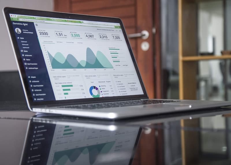
How to Set Up an Ecommerce Data Dashboard
A comprehensive guide to building an ecommerce analytics dashboard from scratch. Covers key metrics, tool selection, data visualization best practices, and actionable insights.
Why Every Ecommerce Business Needs a Data Dashboard
Running an ecommerce business generates massive amounts of data every single day. Customer behavior, inventory levels, marketing performance, and financial transactions all produce streams of information that are valuable but overwhelming. A well-designed data dashboard consolidates these disparate data sources into a single view, allowing you to monitor the health of your business at a glance and make decisions based on facts rather than intuition.
Without a dashboard, most merchants rely on checking individual platform analytics — logging into Shopify, Google Analytics, Facebook Ads Manager, and their email marketing tool separately. This fragmented approach makes it difficult to connect cause and effect. Did that Facebook ad campaign actually drive sales? Are high traffic pages converting poorly? A unified dashboard answers these questions instantly, saving hours of manual data gathering every week.
Selecting the Right Metrics for Your Dashboard
The most common mistake in dashboard design is including too many metrics. A dashboard packed with dozens of data points becomes noise rather than signal. Start with the essential ecommerce KPIs: total revenue, conversion rate, average order value, customer acquisition cost, and gross margin. These five metrics provide a high-level health check that every stakeholder in your business can understand.
Layer in channel-specific metrics based on your business model. If you run paid ads, include return on ad spend and cost per click. If email marketing is a major channel, track open rate, click-through rate, and revenue per email sent. For inventory-heavy operations, monitor stock turnover rate and days of inventory on hand. The key is to only add a metric when you have a clear action you will take based on its value. Every dashboard element should answer a specific business question.
Choosing Your Dashboard Platform
Your choice of dashboard tool depends on your technical resources and budget. For merchants who want a no-code solution, Google Looker Studio is the most accessible option. It connects directly to Google Analytics, Google Ads, and Shopify data through built-in connectors. The drag-and-drop interface makes it easy to create visualizations without any programming knowledge, and it is free to use with a Google account.
For businesses that need more flexibility and data blending, Metabase and Tableau offer powerful options. Metabase is open source and excellent for teams that want to write SQL queries for custom metrics. Tableau provides the most sophisticated visualization capabilities but comes with a higher price tag and steeper learning curve. For Shopify-specific needs, apps like Triple Whale and Polar do the heavy lifting by automatically pulling data from your store, ads, and analytics into pre-built ecommerce dashboards with minimal setup.
Designing Effective Visualizations
The best dashboards use the right chart type for each metric. Use line charts for trends over time — revenue by month, conversion rate by week, customer acquisition cost by quarter. Bar charts work well for comparisons between categories, such as sales by product line or traffic by channel. Gauges or progress bars are effective for tracking progress toward goals, like daily revenue targets or inventory minimums.
Keep your color palette simple and intentional. Use one accent color to highlight the most important metric on each page. Reserve red for metrics that are below target and green for those that are exceeding goals. Group related metrics together in logical sections — financial metrics in one area, marketing metrics in another, operations metrics in a third. Each section should fit on a single screen without scrolling so you can absorb the full picture at a glance.
Connecting and Automating Data Sources
A dashboard is only as good as the data feeding into it. Establish automated data pipelines so your dashboard refreshes daily or even hourly without manual intervention. For Google Looker Studio, set up scheduled data refreshes from each connected source. For more advanced setups, use tools like Zapier or Make to move data from your ecommerce platform, payment processor, and ad platforms into a central database or spreadsheet that feeds your dashboard.
Pay special attention to data consistency. Ensure that metrics like revenue, orders, and customers are defined the same way across all sources. A common pitfall is having different attribution windows in Google Analytics versus your ad platform, leading to revenue figures that do not match. Define your data dictionary once and enforce it across all connected sources. Schedule monthly audits where you compare dashboard figures against your raw platform data to catch any sync issues early.
Turning Dashboard Data Into Actionable Decisions
The ultimate purpose of your dashboard is not just to display data but to drive action. Configure alerts that notify you when key metrics deviate from expected ranges. For example, set an alert when conversion rate drops below two percent, when cart abandonment rate spikes above 80 percent, or when return on ad spend falls below three times. These alerts allow you to respond to problems in real time rather than discovering them during a weekly review.
Create a weekly dashboard review routine where you examine trends, identify anomalies, and decide on specific actions. If average order value is declining, plan a cross-sell or upsell campaign. If customer acquisition cost is rising, investigate which channels are underperforming and adjust budget allocation. Document the decisions you make from your dashboard and revisit them in subsequent reviews to measure their impact. Over time, this data-driven rhythm will become one of your most valuable business processes.